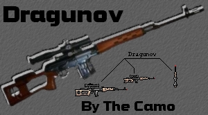
 Dragunov for Scout [UPDATED x3].
  13 like it!
 Offline
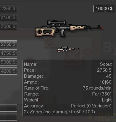
 This is my fourth skin I upload here, I hope you like it.Type: Scout
 I made the skin alone.You can use it, but do not reedit/remix it.I though I can't make it since its too long gun, but I finished it, it's drop image may be little too long for tiles,
 offset is 1/5 tile.
Update x2: (Buy menu "Receiver" and drop image "Magazine")
Update x3: (Colors)

edited 5×, last 25.07.10 07:51:48 pm
Approved by CY
 Download
7 kb, 620 Downloads

 1
1 


 btw, receiver is pretty tin in real..