 Camo Galil Model
  10 like it!
 Offline
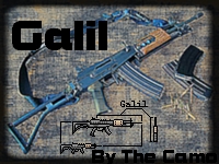
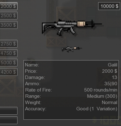
 This is my fifth skin I upload here, I hope you like it.Type: Galil
 I made the skin alone.You can use it, but do not reedit/remix it.It was hard to make since it doesn't have much details, so I needed to add some custom details to it, nothing much, just some dots.
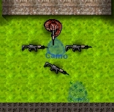
Edit: Sorry for the first image, couldn't find anything better

edited 2×, last 22.07.10 09:59:09 am
Approved by Sparty
 Download
11 kb, 464 Downloads

 1
1 
 good skin ! It has shading , good drop and buy and hand image , and it has something special 5/5