@ Kolia_rus: Thank you very much for the valuable feedback!
Quote
It would be better if the buttons in the sticky menu on mobile devices all were of the same size and were displayed as icons rather than text, or maybe as icons with text (as in YouTube Android app).
Icons are not as easy to understand as text so I chose text. Icons with text would take too much space on slim devices.
Quote
Also, there's a silly gap between the "Community" button and the language selection menu. Phones are small, such gaps are waste of space.
That's because the menus are left aligned and the profile and langauge selection right aligned. Just like in the desktop version. I get the point though. It probably makes sense to move the menu more to the right. And maybe to even move the language button completely to the left because it is used less often. That would probably improve usability on mobile. Will try that out.
Quote
The "Up" button in the bottom right corner is too big compared to the profile picture and other elements of the sticky menu (on mobile devices).
Very valid point. Will fine tune the size a bit!
Quote
Another nitpick for mobile version: links in the footer are displayed in 6 rows instead of 2, and there are useless gaps, too.
Could optimize space usage there, that's true. It's not really a problem though as this is the footer area and you have to scroll down to see it. So it doesn't really take up space which would be required for anything else.
Regarding "*)": I did this by intention and I saw it elsewhere but I guess you're right. Changed that.
Quote
The Unreal Software logo in the header should display the dropdown menu on hover (as it does now), and open the Home page once you click on it (it doesn't now).
This was already suggested by others. Doesn't work on mobile for obvious reasons. I could add that to the desktop version though.
Spam Cooldown: I think it's quite obvious but I may adjust it.
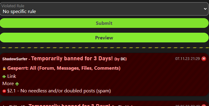
Submit/Preview button order: Very good point. Will probably swap their positions. I didn't consider that the primary option should be on the right for mobile (and it not being there doesn't actually bother me as I'm lefthanded...)  Unreal Software bugs and errors thread


 Offline

 No, user mode colors are just part of the stylesheet like (nearly) everything else. That's one of the things I improved. I can and will adjust them easily per style. "Mr. Brightside" is pretty "beta" and not as optimized as the default style. Still needs some tweaking.
 Probably not a bug
 Bug 1: The "Locked" (or whatever word that was similar) string is currently left untranslated in English locale.